Table of Contents
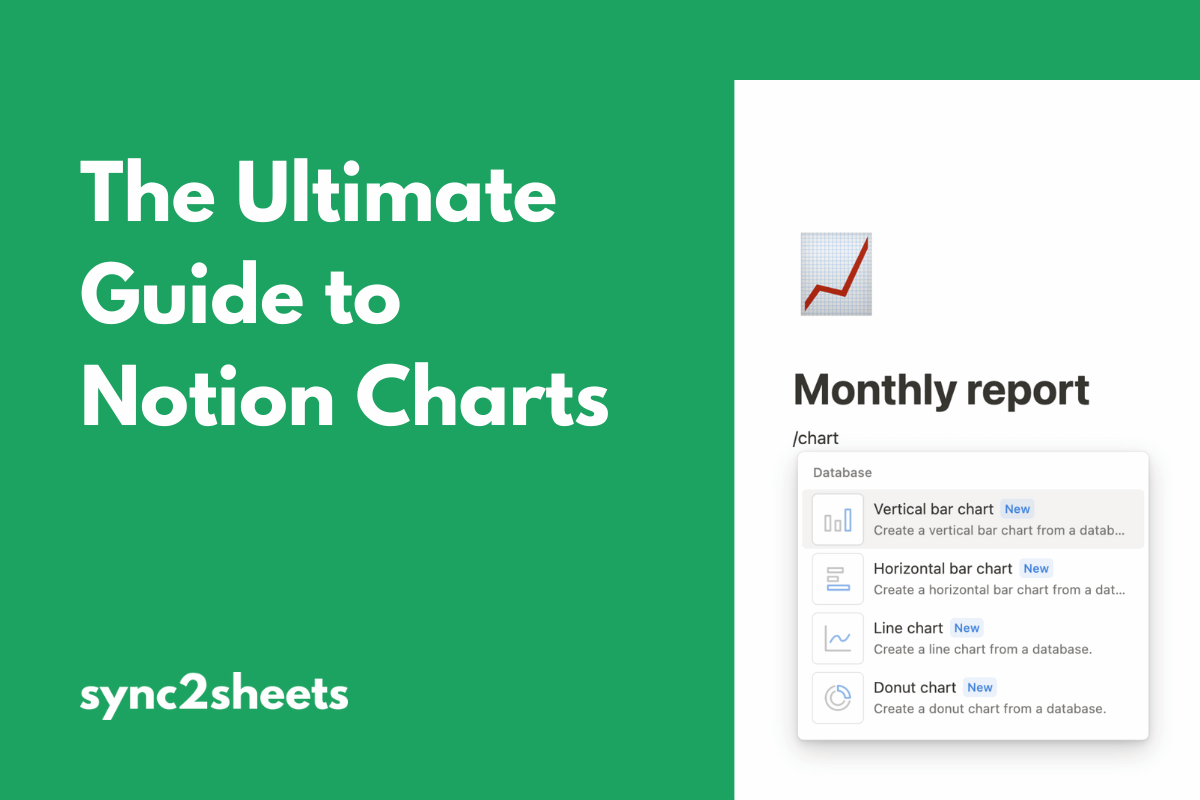
One of the most highly requested Notion features has finally arrived! In August 2024, Notion released their new charts visualization option to the public.
But how revolutionary is this feature? Will it transform how you use Notion, or is it just hype?
To help you decide, we created this guide.
Below, we look at what Notion charts are, how to create them, and how you can use them in your work. We’ll also examine Notion charts pricing and how Notion charts compare with Google Sheets.
Notion Charts Overview
Charts add a new way to visualize the contents of your Notion databases. So in addition to viewing your data as a list, table, or calendar, you can now represent it as a chart!
You can use Notion charts anywhere in your workspace. And they’re designed to work with the existing Notion features you already know and love. For instance, you can combine charts with Notion automations to create beautiful project templates.
Charts are most useful when you have large volumes of data that you need to make sense of. They’re also handy in a team setting, where your Notion databases can quickly become overwhelming to read at a glance.
Notion currently includes the following chart types:
- Vertical bar chart
- Horizontal bar chart
- Line chart
- Donut chart (also known as a “pie” chart)
Each of these chart types offers color customization, numerous style options, and some basic options for how the chart displays your data.
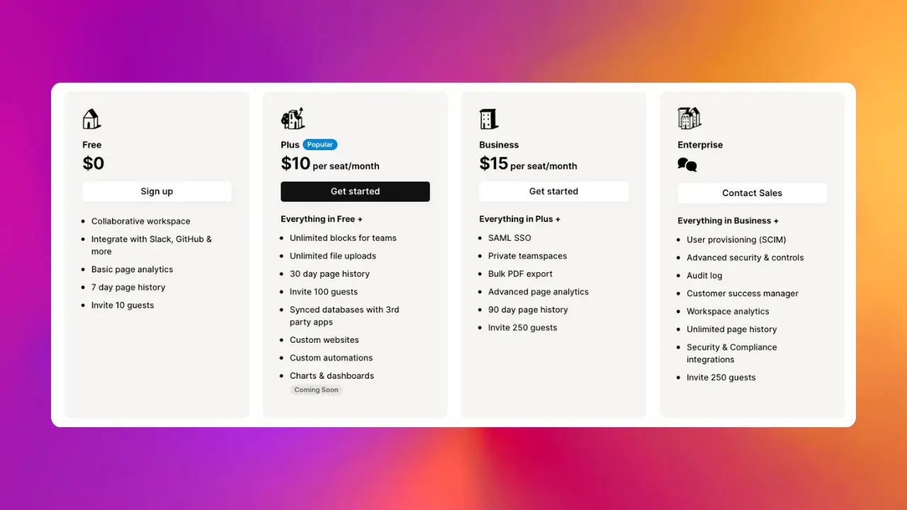
Notion Charts Pricing
Before we go any further, let’s address how pricing works for Notion charts.
Free plan users are limited to one chart per workspace. If you try to create additional charts, Notion will prompt you to upgrade to a paid plan.
Unlimited charts are available on all paid Notion subscriptions (i.e., Plus plan and above).
How to Create Your First Notion Chart
The best way to understand Notion charts is to see them in action. Let’s walk through a simple example and create a Notion chart together.
1. Choose a database to work with
To get the most out of charts, you need a decent volume of data. For our example, we’ll use this free TV Show Tracker template (which you may recognize from our tutorial on importing live web data into Notion).
The TV Show Tracker already contains lots of info that will be perfect for displaying on a chart. But feel free to use your own data if you prefer.
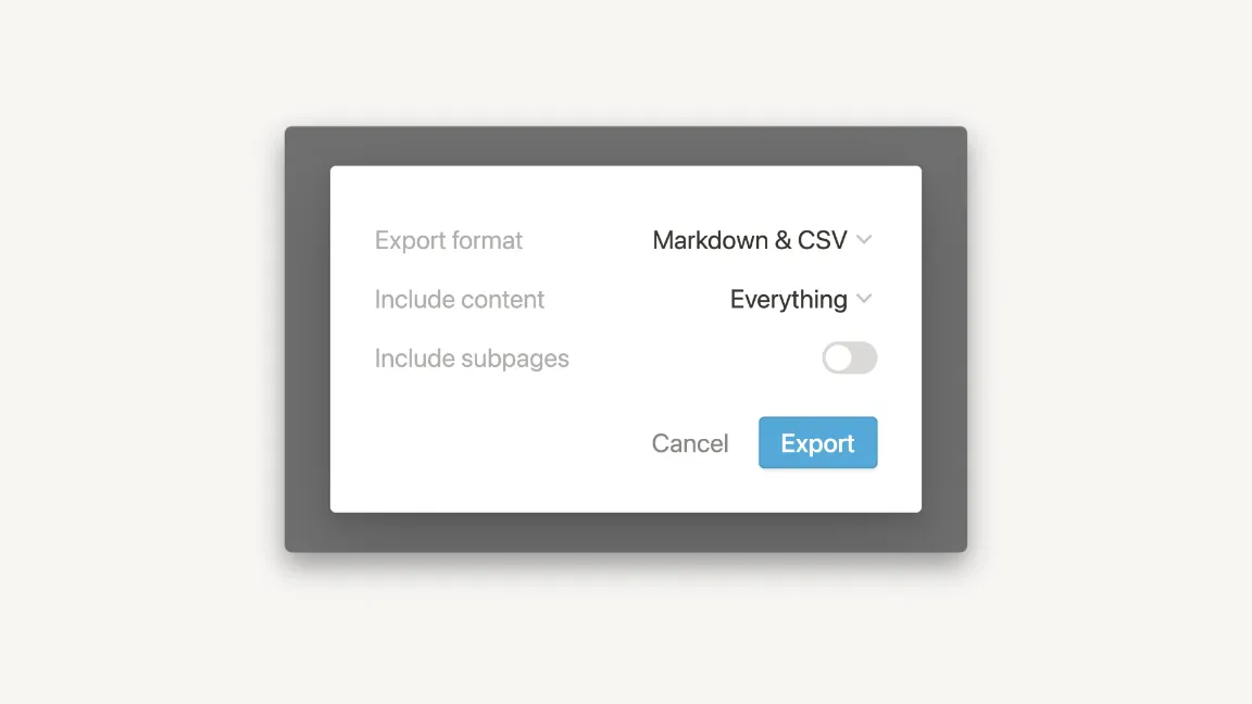
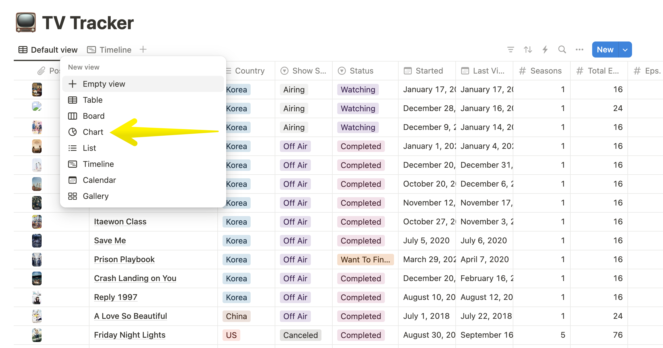
2. Add the chart view
Once you’ve chosen your database, it’s time to make the chart. All you have to do is click the + icon at the top of your database and choose Chart from the available options.
3. Choose the data to display
You should now see some sort of chart in your workspace. However, it may not display the data you want by default.
To fix this, click the … icon at the top right of your chart. This will open the View options.
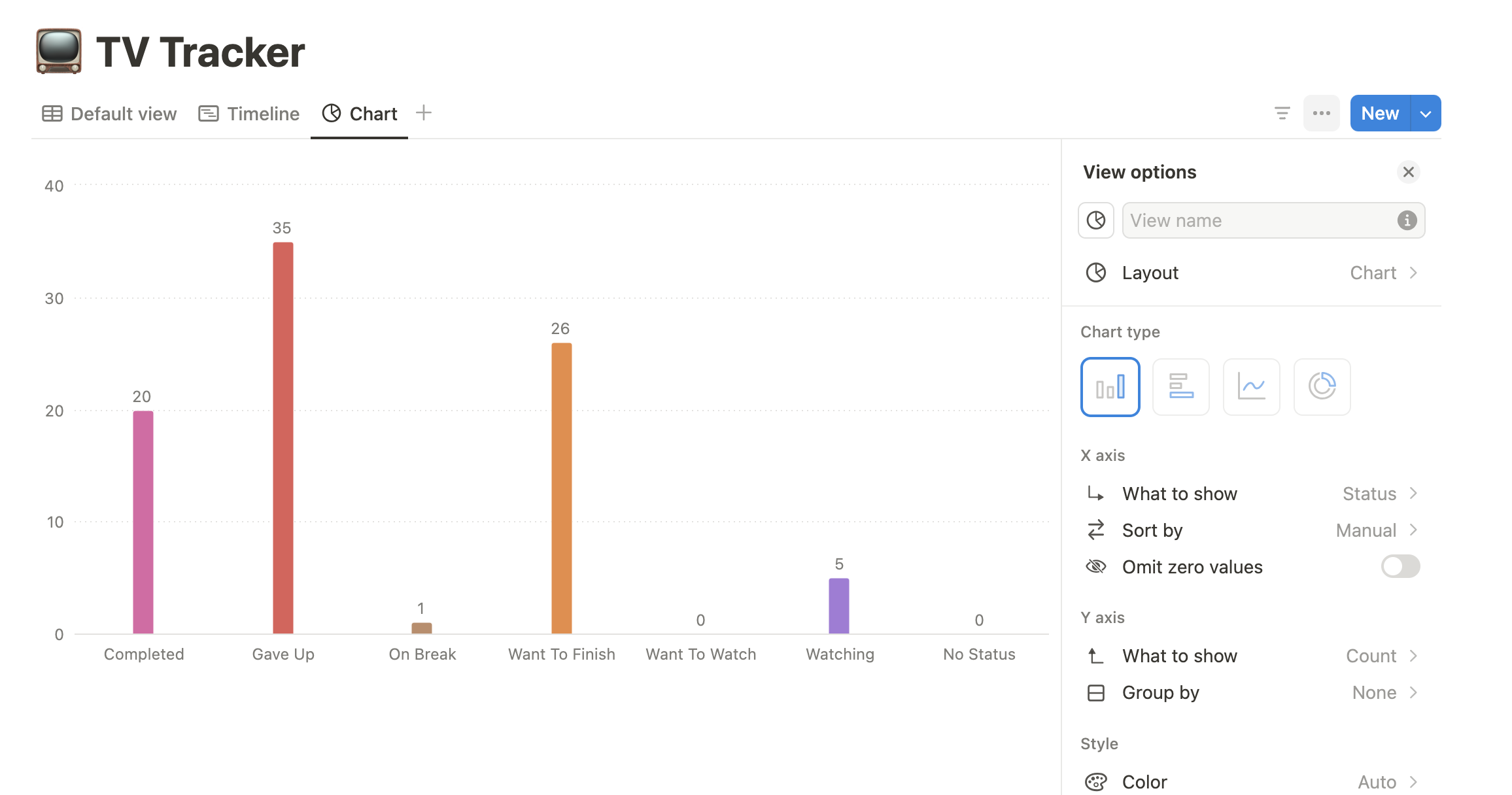
First, you’ll be able to choose your chart type. We’ll stick with Vertical bar for now, but feel free to pick what makes the most sense for your project.
From there, you’ll see different options depending on which chart type you selected. The Vertical bar, Horizontal bar, and Line types include options for what to display on the X and Y axes.
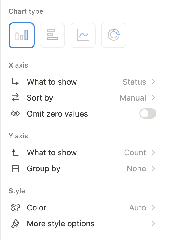
The Donut chart, meanwhile, includes options for what each “slice” of the chart should represent.
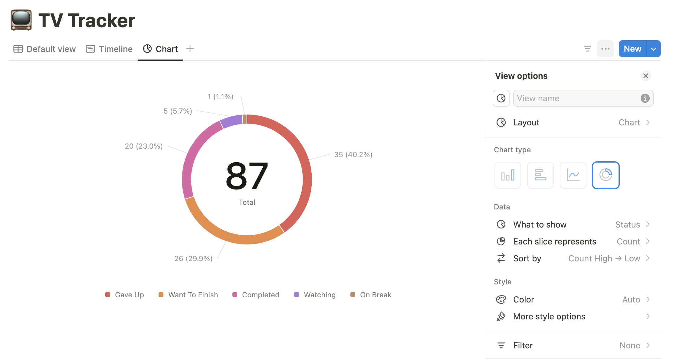
Let’s modify our chart so it displays each show ranked by number of seasons. To do this, we’ll change What to show on the X axis to “Seasons”. We’ll keep the Y axis options as they are for now.
The result should be something like this:
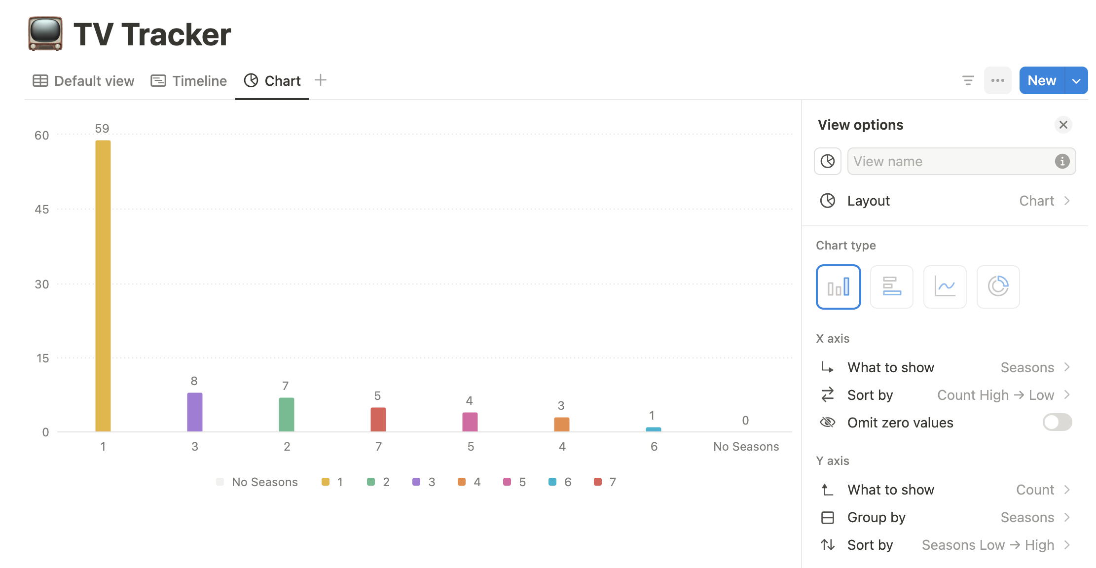
This is working well, except for one thing. The chart currently displays a “No seasons” column, which doesn’t make sense for this type of data.
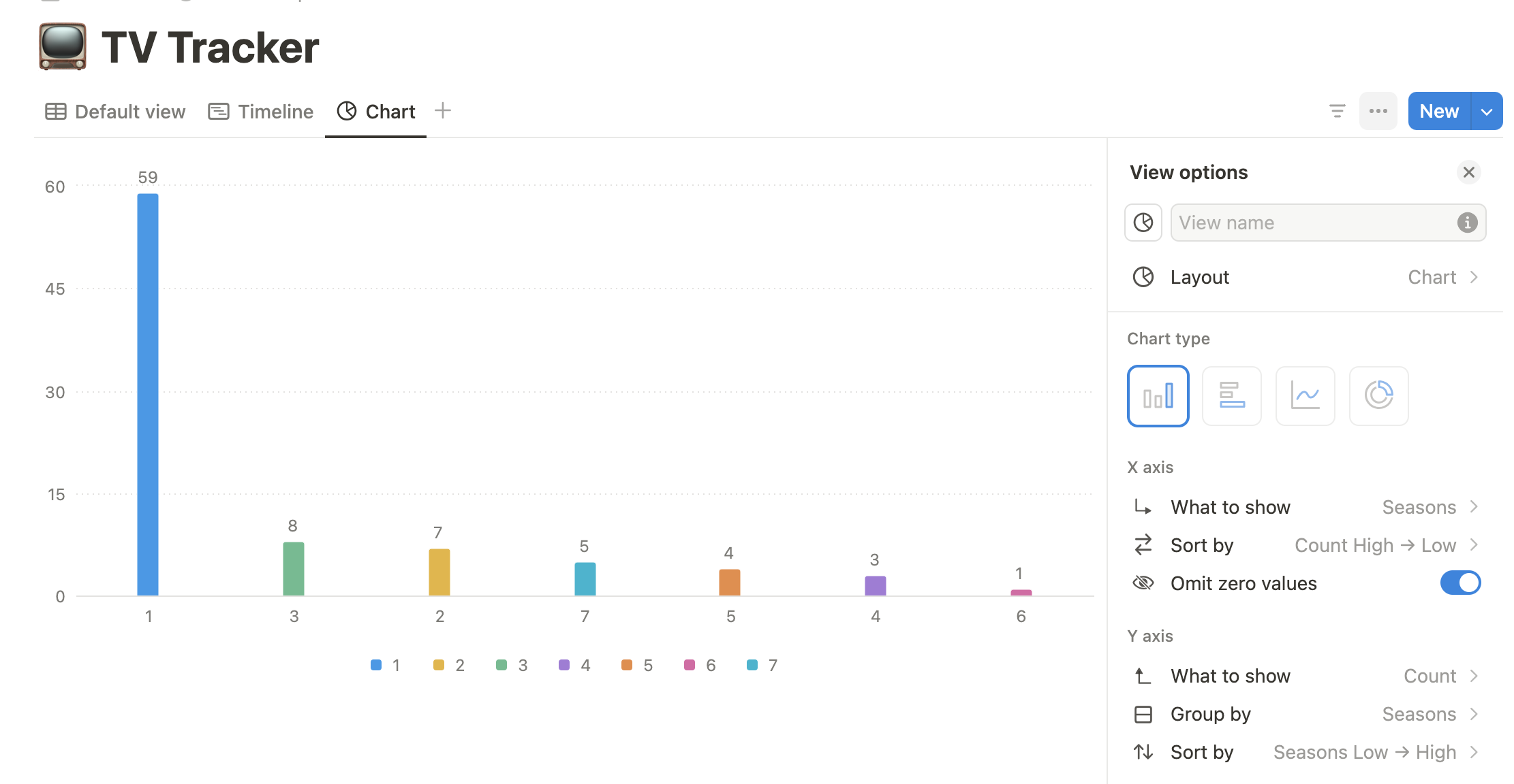
To fix this, we’ll choose Omit zero values under the options for our X axis. The chart now excludes this data and looks a lot better:
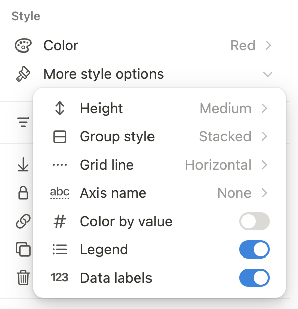
4. Customize your chart’s appearance
Congrats! You just created your first Notion chart. You could stop here if you wanted. But before we move on, let’s briefly touch on how to modify your chart’s appearance.
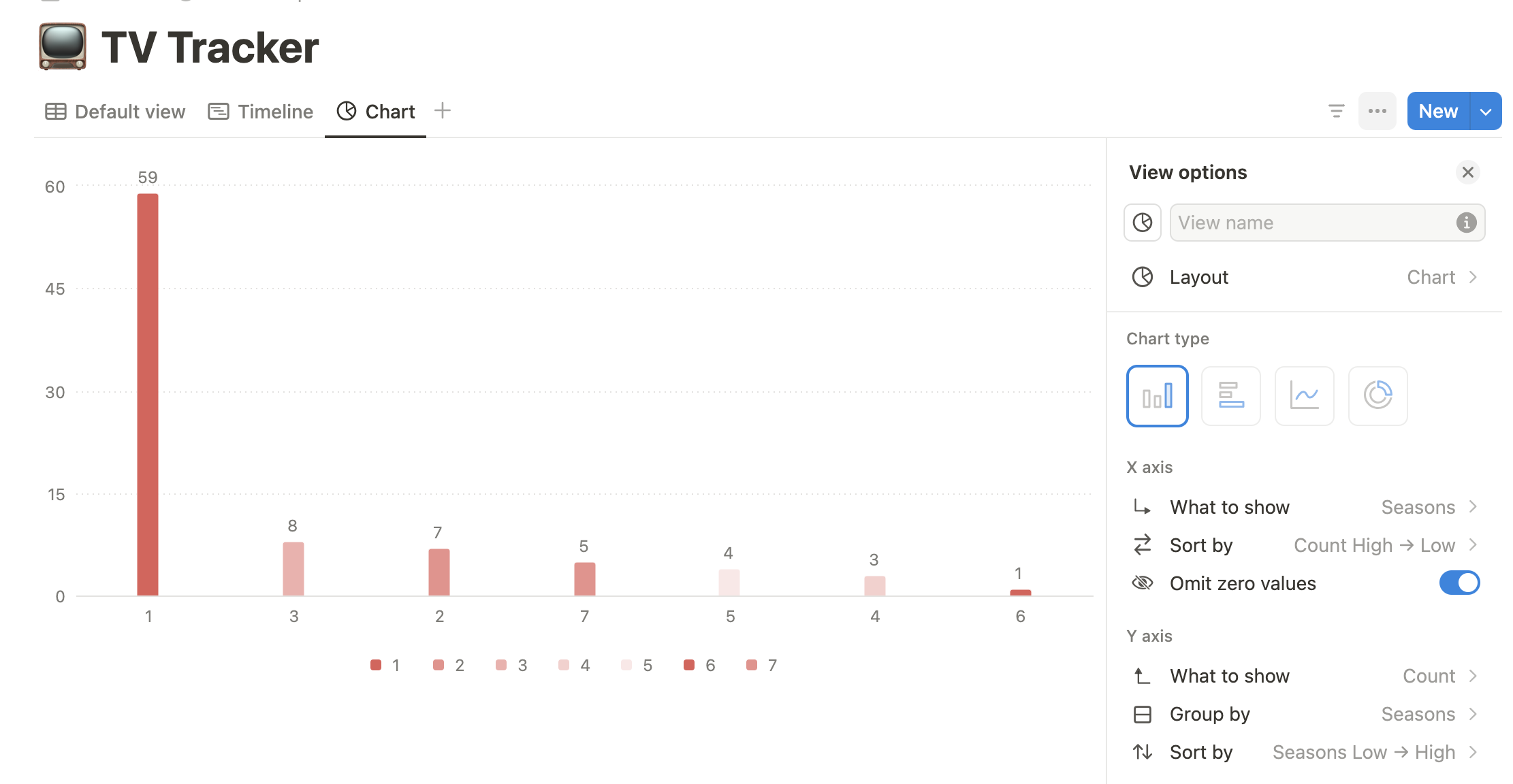
Aside from changing the type of chart, you can also choose different color palettes. For instance, here’s our TV show chart with the color scheme changed to shades of red:
Furthermore, you can customize things like the chart’s overall height, the type of grid line, and the data labels.
This example is just a preview of what’s possible. To see the full power of charts in action, create your own
Need some inspiration? Keep reading.
Notion Charts Use Cases
Let’s look at some more advanced use cases for Notion charts. The following examples highlight how you can use charts for OKR tracking, project management, and content planning.
Example 1: OKR Tracker
Charts can help you (and your company’s leadership) measure progress on your OKRs. If you’re already tracking OKRs in your company or team’s workspace, it’s a simple matter to add chart views to your existing project data.
You can see this approach in action with Notion’s Objectives & Key Results Tracker. A bar chart displays progress on key results, while a donut chart tracks the status of different objectives.
Example 2: Product Roadmap
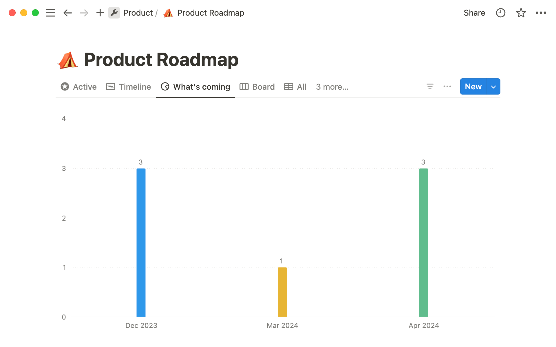
Rolling out new features for your product can strain your organization’s resources and capacity. Fortunately, you can use charts to spot problems before they arise.
For instance, you could use something like Notion’s Product Roadmap template to create a bar chart that shows your upcoming features by month. This information will help project managers keep things on track and avoid delays.
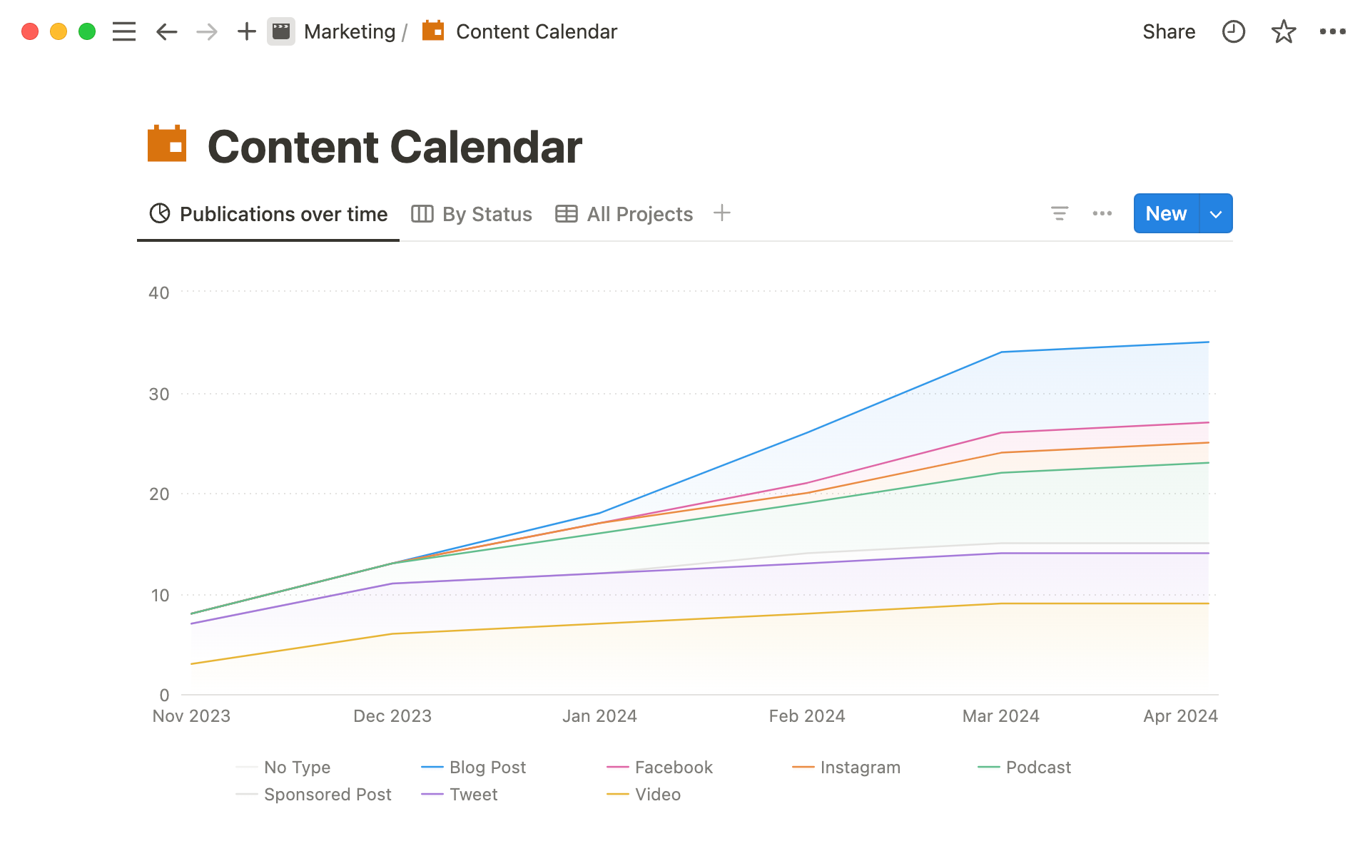
Example 3: Content Calendar
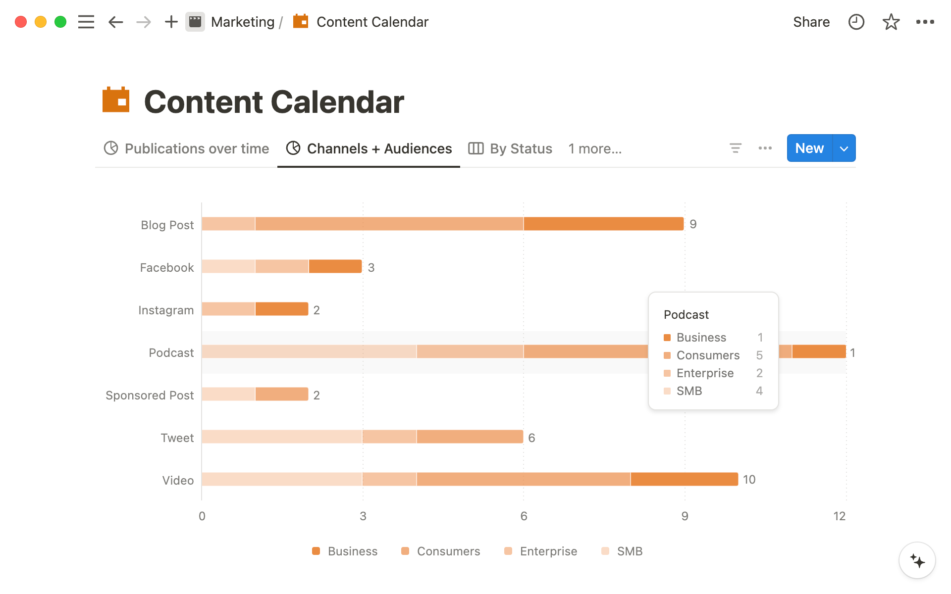
Notion’s built-in calendar and board views already make it a great choice for content planning. Charts can help you take things to the next level, offering new ways to track your content efforts.
Take a look at Notion’s Content Calendar template for an example. Using this template, you could create a line chart comparing when content was scheduled vs. when you actually published it. This can help you make improvements in your content production workflow.
Notion Charts vs. Google Sheets
Comparisons between Notion and Google Sheets are nothing new. But does the addition of charts turn Notion into a Sheets killer?
Hardly.
The main advantage Notion charts have over Sheets is that charts are built into Notion. So if your goal is only to use Notion and never a third-party app, charts are a game-changer.
Overall, though, Sheets is still the superior option for manipulating and visualizing data.
First, Sheets offers you a lot more power for filtering and modifying your data…even before you create the chart. You can perform data manipulation with Notion Formulas, but Sheets offers far more (and more advanced) options here.
Second, Notion chart types are very limited compared to Sheets. As we discussed above, Notion offers 4 chart types:
- Horizontal bar
- Vertical bar
- Line
- Donut
Sheets, in contrast, offers 17 types of charts and graphs:
- Line
- Combo
- Area
- Column
- Bar
- Pie
- Scatter
- Histogram
- Candlestick
- Organizational
- Tree map
- Geo
- Waterfall
- Radar
- Gauges
- Annotated timeline
- Table
Overall, then, Notion charts are useful for creating simple visualizations or dashboards within your workspace. But for anything more complex, Google Sheets remains king.
Fortunately, you don’t have to choose between the power of Sheets and the beauty of Notion. Using Sync2Sheets, you can build complex charts in Sheets and display them in your Notion workspace with just a few clicks. Download the extension to get started.
Conclusion
You should now have a basic understanding of Notion charts, including how to use them in your projects.
Here’s a summary of what we covered:
- Notion charts are a new type of database view
- Free Notion plans are limited to one chart per workspace; paid subscribers can create unlimited charts
- Notion offers four types of charts:
- Horizontal bar
- Vertical bar
- Line
- Donut
- Use cases for charts include tracking OKRs, building product roadmaps, and planning content
- Google Sheets offers more options than Notion for analyzing and visualizing data
How are you using Notion charts in your work? Share your creations with us on X!